Jan 10, 2026

Let's be honest, excellent website design is about so much more than a pretty layout. It’s a powerful business tool that works around the clock to find customers, guide them through what you offer, and convince them to take the next step. It’s what separates a simple online brochure from a digital platform that actively grows your business.
Your Website Is Your Hardest-Working Employee
Think of your website as your digital storefront. It’s open 24/7, even when you and your team have clocked off. For any small business owner, it's often the very first interaction a potential customer has with your brand.
And that first impression happens in a flash. A staggering 94% of first impressions are purely design-related. That means in just a few seconds, visitors decide if your business is credible, professional, and trustworthy based entirely on how your site looks and feels. An outdated or confusing website? That's like walking into a cluttered shop with unhelpful staff—it just drives people away.
On the flip side, an excellent website acts like your best salesperson. It anticipates what your customers need, answers their questions clearly, and makes it incredibly simple for them to buy from you. This isn't just about looking good; it's about creating a smooth, intuitive experience that builds confidence and turns curious visitors into loyal customers.
Many agencies now approach this by building sites with performance, structure, and long-term maintainability in mind from day one - the kind of philosophy you’ll see in a performance-first web design agency.
More Than a Pretty Face—It's a Business Engine
Many entrepreneurs get hung up on the cost and complexity of building a great website. They see it as an expense, not what it truly is: a core investment in the growth of their business. A well-designed site isn't some static page you set and forget. It's an active part of your daily operations that can deliver a real return on investment (ROI).
Generate leads automatically. By capturing visitor details through clear forms and calls-to-action, your site can fill your sales pipeline while you focus on running the business.
Build unshakable brand trust. A professional, consistent design signals reliability and expertise. It makes customers feel secure choosing you over the competition.
Save you time and resources. A great site can answer common questions, handle bookings, and process sales, taking a huge administrative load off your team.
For instance, a local physiotherapy practice could use its website to let patients book appointments online, cutting down on phone calls and manual scheduling. Likewise, a SaaS company can use its site to offer demos and handle subscriptions, automating the entire sales funnel.
The core idea is simple: An excellent website works for you. It's a strategic asset designed to achieve specific business goals, from boosting sales to improving customer service.
This guide is here to demystify the whole process for business owners. We'll break down what "excellent" really means in practical terms and show you how to build a website that delivers a tangible return on your investment, giving you a solid competitive edge.
The Seven Pillars of Excellent Website Design
What separates a simple online brochure from a powerful business tool? It comes down to a handful of core components. Think of these as the seven essential pillars holding up your digital storefront. Get these right, and you’re not just building a website; you’re building a reliable, hardworking asset for your business.
A well-designed site has a clear job: to attract, guide, and ultimately persuade potential customers.
This diagram shows that a site's purpose is a journey, starting with grabbing someone's attention and ending with a clear, persuasive action.
Let's break down the pillars that make this journey happen.
Comparing Good vs Excellent Website Design
Before we dive deep, it's helpful to see the difference between a website that just 'does the job' and one that truly excels. Many businesses settle for 'good enough', but excellence is what drives real growth.
Design Pillar | A 'Good Enough' Website | An 'Excellent' Website |
|---|---|---|
UX & UI | Looks okay and is mostly usable. | Feels effortless, intuitive, and visually polished. |
Performance | Loads in a few seconds. | Loads almost instantly, feeling snappy and responsive. |
Mobile Design | The desktop site shrinks to fit a phone screen. | Designed for mobile first; feels natural to use on a phone. |
SEO | Has basic keywords and a sitemap. | Built from the ground up to be easily found by Google. |
Accessibility | Usable by most people. | Designed so people with disabilities can use it easily. |
Conversion | Has a 'Contact Us' page. | Every page gently guides visitors towards a specific goal. |
Brand Fit | Uses the company logo and colours. | The entire experience feels like a true extension of the brand. |
As you can see, the leap from good to excellent involves a shift from simply being present online to being strategically effective. Now, let’s explore each pillar in more detail.
1. User Experience (UX) and User Interface (UI)
People often use these two terms interchangeably, but they’re quite different.
Imagine going to a restaurant. The User Experience (UX) is the entire visit—how easy it was to book a table, the comfortable seating, the friendly staff, and the logical flow of the meal. In short, it’s how the whole experience felt.
The User Interface (UI) is the beautiful design of the menu, the style of the cutlery, and the overall look of the dining room. It’s what you see and interact with.
On your website, UX is about making the journey intuitive and frustration-free. UI is about making that journey visually pleasing. You absolutely need both.
2. Performance and Speed
Website speed isn't just a technical detail; it's a core business metric. In today's world, patience is thin. A mere one-second delay in page load time can cause a 7% drop in conversions. For an e-commerce store, that's real money walking out the door.
A slow website is the digital version of a shop with a massive queue just to get inside. Most people will just give up and go to your competitor.
3. Mobile-First Design
It’s no longer enough for your website to simply "work" on a phone. With more than half of all web traffic now coming from mobile devices, your site has to be designed for the mobile experience first.
This means thinking about thumbs, not mouse clicks. It means clear navigation, buttons large enough to tap, and text that’s easy to read on a small screen. A mobile-first approach ensures you’re properly serving the majority of your audience, whether they find you on a laptop at work or their smartphone on the train.
4. SEO-Friendliness
What good is a beautiful, fast website if nobody can find it? Search Engine Optimisation (SEO) is the art and science of building your site so that search engines like Google can easily understand what it's about and show it to the right people.
This isn’t about tricking Google. It’s about having clear navigation, relevant content, fast loading times, and a mobile-friendly layout—all things that also create a better experience for your human visitors. In fact, good SEO is often just a natural result of excellent website design.
An SEO-friendly website is like a shop with clear signs on a main street—easy for new customers to discover. A site without SEO is like a shop hidden down an unmarked back alley.
5. Accessibility
Accessibility means designing your website so that people with disabilities can use it. This includes users with visual, hearing, motor, or cognitive impairments.
This is not only the right thing to do, but it’s also smart business. By making your site accessible—with things like descriptive text for images and good colour contrast—you open your doors to a wider audience. It also tends to improve the experience for everyone and can even give your SEO a little boost.
6. Conversion-Centred Design
An excellent website is built with a purpose. It doesn’t just sit there presenting information; it actively persuades visitors to take action. This is called conversion-centred design. A huge part of this is having a strategic store design and layout engineered to guide users and boost conversions.
Whether your goal is to sell a product, book a meeting, or get a newsletter sign-up, every single element on the page should work together to lead the user towards that goal.
Actionable Takeaway:
Use Clear Calls-to-Action (CTAs): Your buttons should be prominent and use action-focused text like “Get Your Free Quote” or “Buy Now.”
Build Trust: Show off customer testimonials, reviews, and security badges to make visitors feel confident.
Make Forms Effortless: Keep your contact and checkout forms as short and simple as possible. No one likes filling out a long, complicated form.
7. Brand Fit and Consistency
Finally, your website must feel like you. It's the digital face of your business, and it should reflect your brand’s personality, values, and promise at every turn.
This goes beyond just using your logo and brand colours. It's about the tone of your writing, the style of your photography, and the overall feeling a visitor gets. When your site is a true extension of your brand, it builds recognition and deepens customer loyalty.
Designing for Your Customers, Not Just Your Brand
It’s tempting to build a website that’s all about you—your logo, your colours, your story. And while your brand identity is absolutely vital, a truly excellent website puts someone even more important first: the customer. This is where User Experience (UX) and User Interface (UI) come in, the two pillars at the heart of any customer-focused site.
Think of it like a fantastic restaurant. The entire journey—from spotting an appealing sign outside, being greeted warmly, finding the seating comfortable, and paying the bill effortlessly—is the User Experience (UX). The beautifully designed menu, the elegant table setting, and the overall décor? That’s the User Interface (UI).
You can't have one without the other. A stunning restaurant with terrible service won't last long, and the same goes for your website.
Your website's UX is the overall feeling a visitor gets while moving through your pages. Is it easy? Frustrating? Intuitive? The UI is the collection of visual elements—buttons, fonts, images—they interact with along the way. Your goal is to make this entire journey feel smooth, logical, and even enjoyable. To get a deeper understanding of this crucial pairing, you can explore the fundamentals of UX and UI design in our detailed guide.
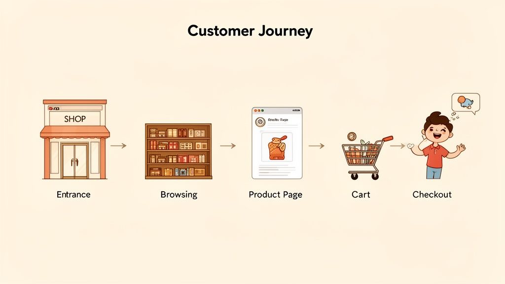
Map Your Customer's Journey
To build an experience your customers will love, you first need to walk in their shoes. A customer journey map is a simple visualisation of the steps a visitor takes on your site to accomplish a goal. You don’t need complex software for this; a pen and paper work just fine.
Let’s imagine a customer journey for an e-commerce store selling running shoes:
Discovery: A potential customer searches Google for "best running shoes for beginners" and finds your blog post on the topic.
Exploration: After reading the helpful post, they click on a link to a recommended shoe on your product page. They see clear photos, specifications, and customer reviews.
Consideration: They add the shoes to their cart and see a pop-up offering a 10% discount for signing up to the newsletter.
Action: Satisfied, they proceed to a simple, two-step checkout and complete their purchase.
By mapping this out, you can instantly spot potential roadblocks. What if the blog post didn't link to the product? What if the checkout was five pages long? Every bit of friction is a chance to lose a customer. This simple exercise forces you to see your website through their eyes, not your own.
An excellent website anticipates the user's next question and provides the answer before they even have to ask. It feels less like a website and more like a helpful conversation.
The Power of Direct Feedback
Mapping the journey is a great start, but it’s still based on your assumptions. The most powerful insights will always come directly from your users. You need to ask them what they think, and it doesn't have to be complicated or expensive.
One of the easiest ways to get this crucial data is by embedding a simple survey right on your website. You can ask targeted questions like, "Was it easy to find what you were looking for today?" or "What's one thing we could improve on this page?"
Tools like Weavely.ai make this incredibly simple for any business owner. You can build and embed a feedback form onto your site in minutes, with no coding skills required. This opens a direct line to your customers, giving you real-world data to fix issues, validate ideas, and continuously improve their experience. This is a practical way to collect tangible insights that lead to a better-performing website your customers will genuinely enjoy using.
Building Your Technical Foundations for Success
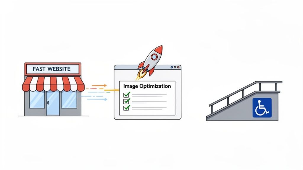
Beyond the colours, fonts, and images, an excellent website rests on a solid technical bedrock. This foundation isn't just something for developers to worry about; it directly impacts every single visitor's experience and, ultimately, your bottom line. Two of the most crucial elements of this foundation are speed and accessibility.
Imagine your website is a physical shop. If the front door is heavy and jammed, most potential customers will just give up and walk away without ever seeing what you offer. A slow-loading website is that jammed door. People today expect speed, and a delay of even a few seconds can send them straight to your competitors.
This isn’t just about keeping visitors happy. Search engines like Google prioritise fast, responsive websites because they offer a better user experience. A faster site often leads to better search rankings, which means more organic traffic and more potential customers discovering your business. To build a robust online presence, you need to prioritise features like a rapid speed advantage.
Why Website Speed Is a Business Metric
In our mobile-first world, fast loading times are non-negotiable. Slow performance doesn't just annoy visitors; it actively costs you money. For an e-commerce store, a snappy site means a smoother checkout and fewer abandoned carts. For a professional services firm, it means potential clients can find your contact information and book an appointment without frustration.
Actionable Takeaway:
Optimise Your Images: Large, uncompressed images are one of the biggest culprits behind slow websites. Before you upload them, use a free online tool like TinyPNG to shrink your image file sizes without sacrificing quality.
Choose Quality Hosting: Think of web hosting as the plot of land your website is built on. Cheap, overcrowded hosting is like building on unstable ground. Investing in a reliable hosting provider ensures your site has the resources it needs to load quickly.
Keep It Simple: Overloading your site with complex animations, dozens of fonts, and unnecessary plugins can seriously bog it down. A clean, focused design is almost always a faster one.
Improving your site's performance is one of the highest-impact investments you can make. For a deeper dive, check out our guide on the impact of page load speeds on SEO and user retention.
The Untapped Opportunity of Accessibility
While speed is about how fast users can access your site, accessibility is about who can access it. An accessible website is designed so that people with disabilities—such as visual, auditory, or motor impairments—can navigate and interact with it effectively. This isn't just a compliance box to tick; it’s a massive opportunity to stand out.
Shockingly, recent research reveals that 96% of websites fail automated accessibility checks, creating a significant barrier for millions of users. This highlights a major gap where SMEs can lead by building a more inclusive online presence.
Making your website accessible isn’t just about doing the right thing; it’s smart business. You instantly open your digital doors to a wider audience that your competitors are likely ignoring.
Actionable Takeaway:
Add Alt Text to Images: Provide a short, descriptive text for every image. This allows screen readers to describe the visual content to visually impaired users.
Ensuring Good Colour Contrast: Use text and background colours that are easy to read. Steer clear of combinations like light grey text on a white background.
Using Clear Headings: Structure your content with logical headings (H1, H2, H3). This helps all users, including those using assistive technologies, understand the page layout and find what they need.
How Great Design Drives Traffic and Sales
Think of your website as more than just a digital brochure; it's a powerful engine for growth. This is where your design choices directly influence tangible results—like getting found on Google and turning curious visitors into paying customers. It’s time to connect the dots between smart design and your bottom line.
Things like intuitive navigation, a flawless mobile experience, and snappy loading times aren't just 'nice-to-haves'. They are critical signals search engines like Google use to decide where to rank you. A well-designed site is naturally more discoverable, acting as a magnet for organic traffic.
Turning Visitors into Customers
Once people land on your site, the game changes from attracting traffic to making sales. This is where conversion-centred design comes in, turning your website into a persuasive salesperson that works for you 24/7. Strategic design elements guide visitors smoothly from initial interest to taking action, seriously boosting your revenue potential.
A massive part of this is removing friction. Every unnecessary click, confusing instruction, or long loading screen is an open door for a potential customer to walk right out. A professional services firm, for example, noticed a high drop-off rate on their "Request a Quote" page. By simplifying their form from ten fields down to just four essential ones, they increased their qualified leads by over 35% in a single quarter.
This just goes to show that excellent website design delivers a direct return on your investment. If you're looking for more ways to make your site more effective, you might be interested in mastering conversion-focused design tips to boost your website’s ROI.
Key Design Elements That Boost Conversions
To turn your website into a conversion powerhouse, you need to nail these critical elements:
Crystal-Clear Calls-to-Action (CTAs): Your buttons should be impossible to miss. Use action-packed text like "Book Your Consultation Now" or "Add to Basket." Ditch vague words like "Submit."
Trust Signals and Social Proof: Put customer reviews, partner logos, and security badges where people can see them. This builds confidence and shows visitors your business is legitimate and trustworthy.
Frictionless Forms and Checkouts: Keep your forms short and sweet. Only ask for the information you absolutely need. For lead generation, a simple tool like Weavely.ai can help you create and embed clean, user-friendly forms that won’t scare potential customers away.
Excellent website design isn't about artistic flair; it's about commercial results. Every design choice should be deliberate, aiming to make the customer's journey easier and your business goals more achievable.
The Unforgiving Nature of Speed
In the world of online sales, speed is everything. A fast-loading website has become non-negotiable, as sites need to load in under three seconds to keep customers from bouncing. This is especially true now that so many people browse on slower mobile networks, where speed directly impacts whether they stick around or leave.
Ultimately, great design is the bridge between what your business offers and what your customers need. By optimising for both search engines and the people using your site, you create a powerful asset that doesn't just attract visitors—it reliably turns them into loyal customers, driving sustainable growth for your business.
Your Action Plan for Excellent Website Design
We’ve covered the essential pillars of what makes a website truly excellent, from the user experience right down to the technical nuts and bolts. Now, let’s turn all that theory into a practical, straightforward roadmap.
This plan will help you move forward with confidence, whether you're building from scratch or giving your current site a much-needed upgrade. It’s not about turning you into a designer overnight; it's about empowering you to make smart, business-led decisions that get results.
Step 1: Define Your Business Goals
Before you get lost in colours and fonts, stop and ask the single most important question: What does my business need this website to _do_? A great website isn't just a digital brochure; it's built around clear, measurable objectives. Think of your goal as the destination and the design as the map that gets you there.
What are you trying to achieve?
Generate qualified leads? Then your design must feature prominent contact forms and unmissable calls-to-action on every service page.
Sell products online? The entire focus has to be on brilliant product photos, intuitive navigation, and a checkout process so smooth it’s almost invisible.
Establish credibility and authority? Your design will need to showcase case studies, testimonials, and an insightful blog.
Without a goal, your website is passive. With a goal, it becomes your most dedicated employee.
Step 2: Understand Your Ideal Customer
Here's a simple truth: you’re not designing the website for yourself. You’re designing it for your customer.
Take a minute to really picture them. What are their biggest headaches? What questions are they typing into Google? What information do they absolutely need to feel confident enough to choose you over a competitor?
For example, a busy professional looking for a B2B service values efficiency above all else. Their perfect website is clean, professional, and gets straight to the point. On the other hand, someone shopping for handmade crafts might want a site full of personality, storytelling, and beautiful imagery. Understanding that difference is what separates a website that works from one that doesn't.
Step 3: Choose the Right Platform
Once you know your goals and your audience, you can pick the right tools for the job. You don't always need a complex, custom-coded site, especially if your primary goal is to provide information and collect enquiries.
Platforms like Squarespace or Wix are fantastic for service businesses that need a professional site that’s easy to manage. If you're building an e-commerce store, a dedicated solution like Shopify is built from the ground up for that exact purpose. The best platform is simply the one that helps you meet your goals without adding unnecessary complexity.
Step 4: Use a Pre-Launch Quality Checklist
Just before you hit the big "go live" button, run through a final quality check. This one simple step can save you from embarrassing—and often costly—mistakes that can damage your reputation from day one.
A pre-launch checklist is your final quality control. It ensures that the first impression your visitors have is a polished and professional one, not one filled with broken links and frustrating errors.
Your checklist absolutely must include these essentials:
Mobile Testing: Does your site look and work perfectly on a smartphone? The dominance of mobile is undeniable. In some regions, mobile devices now account for over 70% of all web traffic, proving just how critical this is. You can learn more about why brands can't afford to ignore mobile-first design.
Form Functionality: Go and fill out every single form on your site. Does it submit correctly? Do you actually receive the notification email?
Proofreading: Read every word. Typos and grammatical mistakes instantly kill your credibility. Consider using a tool like Grammarly to catch things you might miss.
Link Check: Click every single link. Make sure it goes where it's supposed to. A broken link is a dead end for your visitor.
By following this straightforward plan, you put yourself in a position to build a website that not only looks great but also delivers real, tangible results for your business.
Your Website Design Questions, Answered
Let's tackle some of the most common questions we hear from business owners. These are the practical, no-nonsense answers you need to move forward with confidence.
How Much Does a Website Cost for a Small Business?
This is the big one, isn't it? The honest answer is that costs can range from a few hundred dollars for a DIY site with a builder like Squarespace to several thousand for a custom build. But the initial price tag is the wrong thing to focus on.
The real question is about return on investment (ROI). Think about it: a $5,000 website that brings in $20,000 of new business is a much smarter investment than a $500 site that sits there doing nothing. Before you think about cost, get crystal clear on your business goals. Smart tools, especially AI for things like content creation, can also help keep costs down without compromising on quality.
How Long Does It Take to Build a New Website?
This really boils down to complexity. A simple, professional "brochure" style website can often be up and running in 2-4 weeks. But if you're looking at a more involved e-commerce store with a large product catalogue or a site needing custom features, you should plan for 2-4 months.
The single biggest factor that can speed up (or slow down) a project? Being prepared. If you have all your text, professional photos, and product details organised from day one, you'll be amazed at how much faster the whole process goes.
Should I Improve My Current Site or Start Over?
You don't always need to tear the whole thing down. Often, you can get fantastic results with targeted improvements. This could mean optimising your site's speed, rewriting key pages to rank better on Google, or giving your mobile design a much-needed overhaul.
However, if your current site is failing on several of the core pillars we’ve discussed—it's not mobile-friendly, it’s painfully slow, and customers get lost trying to find anything—then a full redesign is probably the most sensible long-term solution. A fresh start is better than patching up a broken foundation.
Key Takeaway: When your site's core foundation is weak, a full redesign is the best path forward. For stronger sites, targeted upgrades are a much smarter investment.
What Is the Single Most Important Part of My Website Design?
Clarity. Simple as that.
Within five seconds of landing on your homepage, a visitor needs to know exactly what you do, who you do it for, and what makes you the right choice. An excellent website design is really just excellent communication. If your core message is fuzzy or buried, the most stunning visuals and fastest technology in the world won't turn visitors into customers. Make sure your unique value is front and centre—loud, clear, and compelling.
