Jan 21, 2026

Let's cut through the tech talk. People often use UX and UI interchangeably, but they are two very different things. Imagine you're building a house:
User Experience (UX) is the architectural blueprint. It’s all about making sure the house is functional and the layout makes sense. Can you get from the kitchen to the dining room easily? Are the light switches where you'd expect them to be? It's the logic behind the experience.
User Interface (UI) is the interior design. It's the paint colours, the style of the furniture, and the light fixtures. It’s everything that makes the house look and feel good to be in.
You absolutely need both. A beautiful house with a confusing layout is a frustrating place to live. Likewise, a perfectly functional house that looks drab and uninviting won't feel like a home.
What UX and UI Actually Mean for Your Business
For a small or medium-sized business, getting this right isn't just a design detail—it's the difference between a website that's a digital brochure and one that actively brings in revenue. They work together, but each plays a unique role in turning a casual visitor into a paying customer.
The Blueprint for Success: User Experience (UX)
User Experience is all about how a person feels when they interact with your website or app. It’s the invisible logic that guides them from point A to point B without any confusion or frustration. When the UX is good, everything just works the way you expect it to. It's intuitive and helps your visitors accomplish their goals, whether that’s buying a product or scheduling a call.
Good UX is invisible. Your customers won’t notice it when it's done well, but they will absolutely notice its absence when they get confused, frustrated, and leave for a competitor's site.
This process is about understanding your customer. What problem are they trying to solve? For an e-commerce store selling running shoes, good UX means a first-time visitor can easily filter by shoe size, brand, and running style to find the perfect pair in under a minute.
The Visual First Impression: User Interface (UI)
If UX is the structure, User Interface is what people see and interact with. It’s the buttons, the fonts, the colour scheme, and even the spacing between elements. UI is the visual layer that builds trust and tells the user's eye where to look.
A financial advisory firm, for example, would use a clean, organized UI with a professional colour palette (like blues and greys) to project trust and expertise. But an online candy shop? They’ll likely use bright, playful colours and fun fonts to create an exciting atmosphere that gets people ready to buy.
If you want to go a bit deeper, we’ve covered the fundamentals of UX/UI design and how they make people genuinely enjoy using a product.
Ultimately, you can’t have one without the other. A stunningly beautiful website that's impossible to navigate is a business failure. So is a perfectly functional site that looks so dated and untrustworthy that no one sticks around long enough to use it.
Why Smart Design Is Your Competitive Edge
Investing in quality UX and UI isn't a "nice-to-have" expense; it's a direct investment in your company's bottom line. A smooth, intuitive website experience makes it effortless for customers to find what they need and take the next step. When your site is easy to use, people are more likely to stay, explore, and buy from you. It's that simple.
On the other hand, a clean and professional interface builds instant credibility. Your website is often the first handshake with a potential customer. If it looks polished and trustworthy, they'll assume your business is, too. That first impression can be the deciding factor that makes them choose you over a competitor with a clunky, outdated site.
This infographic breaks down the core components visually, showing how the strategic planning of UX and the visual polish of UI come together.

It’s a clear reminder that while both disciplines focus on the user, they tackle different parts of the puzzle to create a complete and satisfying experience.
The Real-World Impact on Your Bottom Line
So, what does this actually mean for your business in terms of dollars and cents? Good design isn't just about looking pretty—it shows up directly in your revenue, customer loyalty, and how people talk about your brand. Research shows that every $1 invested in UX can return between $2 and $100.
The table below lays it out plainly, comparing the outcomes of investing in thoughtful design against the consequences of neglecting it.
The Business Impact of Good vs Bad Design
Business Metric | Impact of Good UX/UI | Impact of Poor UX/UI |
|---|---|---|
Conversion Rates | Significantly higher as clear paths guide users to purchase. | Frustrated users abandon carts, leading to lost sales. |
Customer Retention | Positive experiences build loyalty and encourage repeat business. | High bounce rates and low engagement mean customers don't return. |
Brand Perception | Builds trust and positions the brand as professional and reliable. | Damages credibility and makes the brand appear outdated or untrustworthy. |
Operational Costs | Reduces the need for customer support by answering questions upfront. | Increases support tickets and complaints due to a confusing interface. |
Market Share | Creates a competitive advantage that attracts and retains customers. | Loses potential customers to competitors with better online experiences. |
Ultimately, a superior online experience isn't a luxury—it's a fundamental driver of sustainable growth. The proof is in the numbers. When a visitor lands on your site, they decide in seconds whether to stay or leave. A commitment to great UX and UI makes them want to stay. Digging into proven user experience design best practices can give you a solid foundation for making those critical improvements.
From Visitors to Loyal Customers
A well-designed digital presence does more than just attract visitors; it builds relationships. By making your customer's journey simple and enjoyable, you're showing them that you value their time. This positive feeling is what creates real loyalty and leads to a much higher customer lifetime value.
For example, collecting feedback to improve this journey is essential. You can use a simple tool like Weavely to create a conversational survey asking customers what they'd like to see improved. This gives you direct insights and helps you make design decisions based on real data, not guesswork.
The goal is to move beyond one-time sales and create an experience people want to come back to. If you're looking to turn your own website into a conversion machine, check out our guide on mastering conversion-focused design to boost your website’s ROI.
How Winning Businesses Use UX and UI
Theory is one thing, but seeing great design in action makes it click. Let’s look at some practical examples from different industries, showing how smart UX and UI directly drive business results. These aren't just cosmetic tweaks; they are strategic decisions that boost your bottom line.

Imagine an e-commerce store with a checkout so simple that cart abandonment drops. Or a professional services site where booking a consultation takes three clicks. These aren't happy accidents—they’re the direct result of smart design choices.
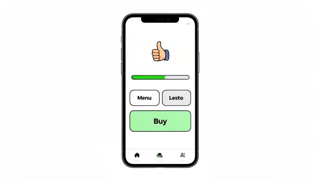
E-commerce: A Simplified Checkout Journey
For any online shop, the checkout is where most sales are lost. A winning e-commerce site obsesses over removing friction at this critical stage.
UX Tweak: Instead of forcing users to create an account, they offer a clear "Guest Checkout" option. This one change can recover a massive percentage of would-be abandoned carts.
UI Tweak: The design features a visual progress bar (e.g., Shipping > Payment > Confirm), large form fields that are easy to tap on a phone, and a single, bold "Pay Now" button that stands out.
The Business Outcome: A local online boutique that implements these changes could see a 15-20% drop in abandoned carts. That’s a direct increase in monthly sales without spending more on ads. It's about converting the traffic you already have.
Professional Services: Effortless Lead Generation
A consultant, law firm, or marketing agency needs a website that generates high-quality leads. The entire goal is to make it incredibly easy for a potential client to get in touch.
UX Tweak: The user journey is built around one clear goal: booking a meeting. Every page gently guides the visitor toward a simple contact form or an online calendar.
UI Tweak: Calls-to-action (CTAs) like "Book Your Free Consultation" are placed in highly visible spots and use a contrasting colour. The booking form itself asks for the bare minimum—just enough to start a conversation.
The Business Outcome: An accounting firm that simplifies its contact process from a five-field form to a two-field "Request a Callback" button can increase qualified leads by over 30%. Less work for the user means more business for you.
SaaS Platforms: Intuitive User Onboarding
For a Software-as-a-Service (SaaS) business, the first five minutes a new user spends on the platform are critical. A confusing dashboard leads to them canceling their subscription before they even start.
A study by Wyzowl found that 86% of people say they’d be more likely to stay loyal to a business that invests in onboarding content that welcomes and educates them after they’ve bought.
UX Tweak: A guided tour walks new users through the most important features, helping them achieve their first "win" (like creating their first project) within minutes of signing up.
UI Tweak: The dashboard is clean and uncluttered. It uses helpful tooltips and visual cues to explain different functions without overwhelming the user with text.
The Business Outcome: A startup offering project management software could reduce new user churn by 40% in the first month just by improving its onboarding flow. This directly boosts customer lifetime value and cuts down on support requests.
Mastering a Mobile-First Experience
Let's be blunt: the first time a potential customer finds your business, it will almost certainly be on a smartphone. A "mobile-first" strategy isn't just a buzzword anymore; it's a basic requirement. It means you design your entire online experience for the small screen first, then adapt it for larger screens like tablets and desktops—not the other way around.
This forces you to focus on what's most important. We're talking about more than just a website that shrinks to fit a phone. A clunky, slow, or hard-to-read mobile site is one of the fastest ways to lose a potential customer forever.
When you consider that over 60% of all web traffic now comes from mobile devices, nailing your mobile UX and UI becomes mission-critical. Digging into insights into the UI/UX market reveals that responsive design can boost customer engagement by up to 55%—a number no SME can afford to ignore.
Key Elements of Mobile-First Design
So, what does a true mobile-first design look like? It all comes down to simplicity, speed, and making things easy for people on the go.
Here are the absolute must-haves:
Large, Touch-Friendly Buttons: Thumbs are not as precise as a mouse cursor. Your buttons and links need to be big enough to tap easily without accidentally hitting something else.
Simplified Navigation: Forget complicated drop-down menus. A mobile site needs a clean, simple menu (like the common "hamburger" icon) that's easy to understand. Key information should never be more than one or two taps away.
Lightning-Fast Load Times: Mobile users are impatient. Every second counts. Compressing images and optimizing your code is non-negotiable. A slow site can hurt your search rankings, something we cover in our guide on the impact of page load speeds on SEO and user retention.
Actionable Next Steps for Your Business
Ready to see how your mobile experience stacks up? Start here.
Test Your Site on Your Phone: Seriously. Don't just use the mobile view on your computer. Grab your phone and try to use your site. Can you complete a key task, like finding your phone number or buying a product? Notice anything that feels awkward or frustrating.
Prioritise Above-the-Fold Content: The most important information and your main call-to-action must be visible the second the page loads, without any scrolling.
Use a Simple Font: Stick to a clean, readable font that is easy on the eyes, even on a small screen. Avoid tiny text or overly decorative fonts that are hard to decipher.
By focusing on these practical elements, you ensure your digital storefront is perfectly designed for the device your customers are already using.
Conducting a Quick DIY Website Audit
You don't need to be a design expert to spot the major issues holding your website back. One of the most powerful first steps you can take is a simple do-it-yourself audit to see where your UX and UI might be letting you down. This isn't about getting lost in data; it’s about looking at your site through your customer's eyes.

The goal here is simple: find the "friction points"—the small annoyances that make visitors give up and leave. Think about it: a study found that 88% of online shoppers won't return to a site after a bad experience. By spotting these problems, you can make changes that directly impact your sales.
Your Five-Minute Audit Checklist
Grab a notepad, open your website, and run through these non-technical checks. Be honest.
The Five-Second Test: Load your homepage. Can a new visitor understand what you do and why it matters within five seconds? If your main message is hidden, you've likely already lost them.
Navigation Clarity: Look at your main menu. Is it dead simple? A visitor should know exactly what they’ll find under labels like "Services" or "Contact." Avoid confusing jargon or clever names.
The Call-to-Action (CTA) Hunt: Go to your most important pages. Is there a clear, obvious next step for the user? A button like "Get a Quote" or "Shop Now" should stand out.
Mobile Data Speed Test: This is critical. Turn off your Wi-Fi and load your site on your phone using only mobile data. Does it load in under three seconds? If not, you're losing a huge chunk of your audience.
Readability Check: Is the text easy to read? Look for tiny font sizes, low-contrast colours (like light grey text on a white background), and huge blocks of text without any breaks.
Get Some Real-World Feedback
Your own perspective is a good start, but it's biased. The best way to find hidden problems is to watch someone else use your site. You don’t need a fancy lab for this.
Ask a friend or family member to complete one specific task on your website. Say something like, "Pretend you want to book a consultation. Can you show me how you'd do that?" Then, stay quiet. Just watch. Their hesitations and questions are pure gold.
For more structured feedback, you could set up a simple form. Tools like Weavely.ai make it easy to build conversational surveys that ask visitors directly about their experience, helping you pinpoint exactly what’s causing frustration.
This simple audit gives you a clear, prioritized list of where to focus your energy, ensuring the changes you make will genuinely improve your business.
Your Next Steps for a Better Digital Experience
Once you've spotted what needs fixing, how do you actually make it happen? The good news is that taking action doesn't have to be a massive, expensive project. For small and medium-sized businesses, there are a few practical paths forward.
The most hands-on route is the DIY approach. Modern website builders like Squarespace or Wix have user-friendly interfaces that let you make meaningful changes yourself. You can adjust layouts, simplify navigation, and make your buttons more obvious without writing any code.
Choosing Your Implementation Path
If your needs are more complex, it might be time to bring in an expert. Your two main options are hiring a freelance designer or partnering with a specialised agency.
Freelancers: Perfect for well-defined tasks like redesigning a single landing page or creating a new logo. They bring specific skills and flexibility, often at a lower cost.
Agencies: The best choice for a complete website overhaul or if you need ongoing support. They come with a full team—strategists, designers, and developers—to ensure everything works together.
A common concern for SME owners is the cost and time involved. But the return on that investment is often surprisingly fast. A small tweak that clarifies your main call-to-action can lead to a measurable jump in leads almost overnight.
The Role of AI in Modern Design
Artificial intelligence is also making professional-grade design more accessible. AI tools are no longer just for big corporations. They can help you brainstorm layout ideas, suggest colour palettes, and even analyze user behavior to predict where customers might get stuck. For example, a tool like Uizard can turn a simple hand-drawn sketch into a professional-looking digital design mock-up in seconds.
Personalisation is a massive driver of growth, with some reports showing that tailored digital experiences can lift revenue by over 20%. Using AI to analyze user behavior can increase conversions by up to 42%.
To really make sure your digital experience shines, I’d recommend digging into a practical guide to improving website user experience. It's full of practical guidance that will help you choose the right approach and give you the confidence to take meaningful action.
Got Questions About UX and UI? We’ve Got Answers.
Even after breaking it all down, it's normal to have a few questions. Let's tackle some of the most common ones we hear from business owners, with straightforward answers to help you move forward.
What’s the Biggest Difference Between UX and UI, Really?
Think of it like this: UX (User Experience) is the overall journey. It’s the feeling someone gets when they use your product—is it simple? Does it make sense? Is it enjoyable?
UI (User Interface) is what they see and touch along the way. It’s the buttons, the menus, the text fields, and all the visual parts they interact with.
Going back to our house analogy: UX is the blueprint that makes the home liveable and functional. UI is the paint on the walls and the comfy sofa that bring the space to life. You need both to work together.
How Much Should a Small Business Budget for Design?
There’s no magic number; it depends on the scope of the project. But the most important shift is to see design as an investment, not just a cost.
A relatively small investment upfront—for a professional audit or a redesign of one critical page like your checkout—can bring back a huge return in sales and customer loyalty.
If you're just starting, focus your budget on the single most important user journey on your site. For most businesses, that’s the path that leads to a sale or a lead. Nailing that one journey will give you the best possible return.
Can I Actually Improve My Website’s UX Myself?
Absolutely. You don’t need to be a design expert to make a real difference. The best place to start is with the basics.
Use the audit checklist from this guide and look for easy wins. Focus on simplifying your navigation, making sure your text is large and easy to read, and checking that your calls-to-action are crystal clear on every page.
Many modern website builders like Webflow or Squarespace also come with great templates that have good UX principles built in. While a professional can help with deeper problems, you can definitely get the ball rolling and see great results on your own.
