Dec 30, 2025

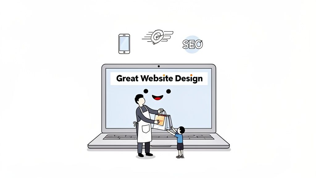
Great website design isn’t just about looking good; it's a strategic business tool built to drive sales by solving your customers' problems. Think of it as the perfect blend of a seamless mobile experience, lightning-fast loading speeds, and clear brand storytelling that turns your website from a simple digital brochure into your hardest-working employee.
Why Great Website Design Is a Business Essential
I see it all the time with small and medium-sized businesses: they have websites that are visually pleasing but completely fail to bring in visitors or turn them into customers. This disconnect happens when design focuses only on aesthetics instead of its real job—achieving business goals. A truly great website is a careful mix of strategy, user experience, and a crystal-clear purpose.
Think of your website as your digital storefront. If the door is hard to open (slow loading), the layout is a confusing mess (poor navigation), or it flat-out doesn't work on a customer's phone (not mobile-friendly), they will simply leave. And they'll go straight to a competitor. This isn't just a missed opportunity; it's lost revenue.
The Pillars of Effective Design
To build a website that genuinely works for your business, you need to focus on a few core pillars that deliver a tangible return on your investment. These aren't just technical buzzwords; they are the absolute foundation of a site that attracts, engages, and converts.
A great website is defined by:
Seamless User Experience (UX): This is all about making your site incredibly easy and even enjoyable to use. It covers everything from logical navigation to clear button placement. To really get your head around this, you can learn more about the fundamentals of UX and UI design in our guide.
Conversion-Focused Layouts: Every single page should guide visitors towards a specific action, whether that's booking a consultation, buying a product, or signing up for a newsletter.
Mobile-First Approach: With most customers browsing on their phones, your site must work perfectly on a smartphone. This is no longer a "nice-to-have"; it's essential.
Lightning-Fast Speed: A tiny one-second delay in page load time can slash conversions by 7%. Speed has a direct and immediate impact on your bottom line.
By shifting your focus from "how it looks" to "how it works," you transform your website from a passive, static brochure into an active, lead-generating machine that operates 24/7.
Winning Customers with Mobile-First Design
Picture this: your bustling shop has a main entrance so narrow that eight out of ten people can't get through the door. You’d get that fixed, wouldn't you? Immediately. A website that isn’t built for mobile phones is the digital version of that exact problem—it actively turns away most of your potential customers.
In today's market, great website design has to start on the smallest screen. This is the "mobile-first" philosophy in a nutshell: you design the entire experience for a smartphone user from the ground up, and only then adapt it for bigger screens like tablets and desktops. It’s a total reversal of the old way of doing things, which involved building a huge, complex site and then trying to awkwardly shrink it down for phones. That approach almost always ends in a clumsy, frustrating mess.
For SMEs, this isn't just a trend to keep an eye on; it's a core business reality. The numbers don't lie: a study by Statista found that over 60% of all website traffic now comes from mobile devices. Even more telling, Google reports that 53% of mobile users will abandon a website if it takes more than three seconds to load. That's over half of your potential business gone before you’ve even had a chance to say hello. You can read more about how mobile optimisation impacts Belgian businesses.
Practical Steps for a Mobile-First Experience
Making your website work brilliantly on a phone doesn't have to be some huge, intimidating project. If you focus on a few key areas, you can dramatically improve the experience for visitors and see a real return on your efforts.
Start with these simple, actionable steps:
Embrace "Thumb-Friendly" Design: Think about how people actually hold and use their phones. Your buttons, links, and menu items need to be big enough to be tapped easily with a thumb, without the user accidentally hitting something else. Put the most important actions—like "Add to Cart" or "Contact Us"—in those easy-to-reach zones at the bottom of the screen.
Use a Flexible (Responsive) Layout: Your website should automatically adjust to whatever screen it’s on. This is what's known as responsive design. Text should resize, images should scale down, and the whole layout should rearrange itself so no one has to pinch and zoom just to read what you have to say.
Optimise Your Images: Massive, high-resolution images are the number one cause of slow-loading mobile sites. Use a tool like TinyPNG or Squoosh to compress your images before you upload them. This one step can slash your loading times, which is a lifesaver for anyone on a less-than-perfect mobile connection.
Key Takeaway: A mobile-first approach isn't just about looks; it's a customer service strategy. Making your site a breeze to use on a phone shows your customers you respect their time and actually want their business. That builds instant trust.
Real-World Example: A Professional Services Firm's Success
Let's look at a real-world case. A small accounting firm had a professional desktop website that listed their services perfectly. The problem? Most of their potential clients—busy entrepreneurs and small business owners—were searching for help on their phones during breaks or after hours.
A quick look at their analytics showed the issue: their mobile site was just a shrunken-down, unusable version of the desktop one. The contact form was tiny, the phone number wasn't clickable, and the whole experience was painfully slow. They knew they had to invest in a proper mobile-first redesign.
The new site was built for phones. It featured a big, clear "Call Us Now" button at the top, simple service descriptions that were easy to scan, and a contact form with large fields that were a breeze to fill out. The results were immediate and frankly, stunning. Within three months of the relaunch, their mobile conversion rate (form submissions and calls) jumped by 40%, and overall new client inquiries grew by 25%. They didn't just fix a design flaw; they finally opened the main door to the majority of their customers.
Why Site Speed Is Your Secret Weapon
In the world of online business, speed isn't just a nice-to-have; it's the currency of customer satisfaction.
Think about it this way: imagine a potential client walks into your shop, only to be completely ignored for ten seconds. They’d walk right out, wouldn't they? A slow-loading website creates that exact same feeling of frustration, pushing valuable customers away before you even get a chance to make your pitch.
Your website's loading time is one of the most critical factors in a great website design experience. It directly influences how long visitors stick around, whether they buy from you, and even how high you appear in Google search results. Every single second—or even millisecond—counts. A slow site isn’t just an inconvenience; it’s a direct hit to your bottom line.
The Real-World Cost of a Slow Website
Slow performance isn't some vague technical issue; it has tangible, negative effects on your business goals. When pages lag, potential customers get impatient and leave. This is what we call your "bounce rate"—the percentage of visitors who land on your site and exit without clicking anything else. High bounce rates tell search engines that your site isn't providing a good user experience, which can seriously hurt your rankings over time.
For businesses, the data is particularly revealing. Research from Google shows that as page load time goes from one second to three seconds, the probability of a visitor leaving increases by 32%. The drop-off is sharp; as load time increases to five seconds, that probability skyrockets to 90%.
The chart below shows just how directly mobile user behaviour is tied to performance, highlighting the link between a fast experience, higher conversions, and the risk of abandonment.
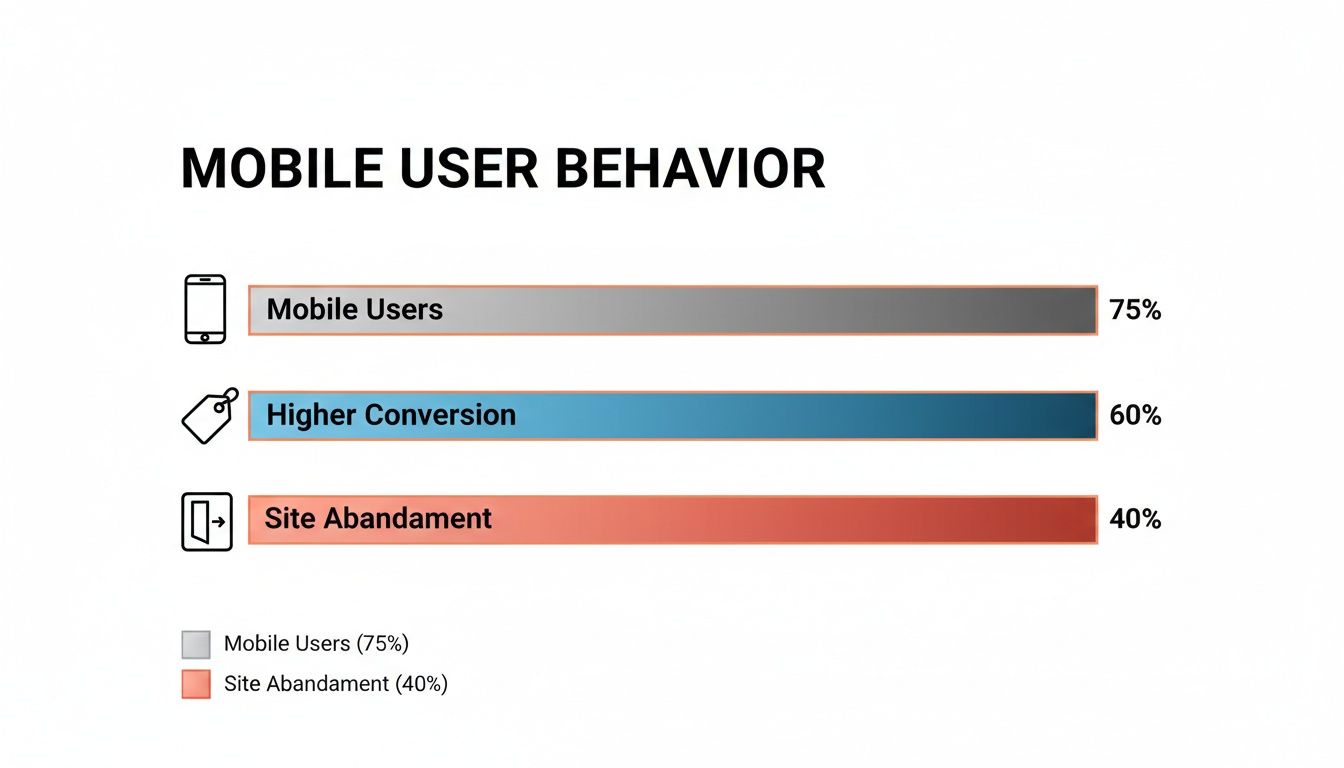
This data makes it crystal clear: a fast, optimised site doesn't just keep users around; it actively encourages them to convert.
To put this in perspective, here’s a quick breakdown of how just a few seconds of delay can impact your bounce rate and, ultimately, your business.
How Website Load Time Impacts Your Business
Load Time (Seconds) | Increase in Bounce Rate Probability | What This Means for an SME |
|---|---|---|
1s to 3s | 32% | You're losing about one-third of potential customers before they even see your content. |
1s to 5s | 90% | The vast majority of your visitors are gone. At this speed, your site is practically invisible. |
1s to 6s | 106% | You’re now actively frustrating visitors. Almost no one will wait this long. |
1s to 10s | 123% | Forget making a sale. A 10-second load time is a guaranteed way to lose business. |
As you can see, the relationship is brutal. Every second you shave off your load time is a direct investment in keeping potential customers on your page.
Simple Fixes to Speed Things Up
Improving your site speed might sound like a job for a team of developers, but many of the most effective fixes are surprisingly straightforward. As an SME owner, you can make a significant difference with a few targeted actions.
Here are three simple wins you can implement right away:
Compress Your Images: Large, unoptimised images are the number one cause of slow websites. Before uploading any photo, run it through a free tool like Squoosh. It can slash the file size by over 70% without any noticeable loss in quality, dramatically speeding up your pages.
Enable Browser Caching: Caching is like giving a returning visitor's browser a memory. It stores parts of your site (like your logo and layout) locally, so it doesn't have to reload everything from scratch on their next visit. Most modern website platforms offer a simple plugin or a one-click setting to enable this.
Choose the Right Hosting: Your web host is the engine that powers your site. A cheap, overloaded server will always be slow, no matter how well-designed your site is. It’s not just about design; how your hosting service affects website speed is a massive factor. Opt for a reputable provider, preferably one with servers located in or near your primary market for faster local access.
Real-World Example: A local e-commerce store selling handmade goods was getting decent traffic but had a high cart abandonment rate. An audit revealed their product pages took nearly seven seconds to load. By compressing images and switching to a better hosting provider, they cut their load time to just under two seconds. The result? Their conversion rate shot up by 35% in the following quarter.
Ultimately, speed is a fundamental part of user experience and SEO. For a deeper look into the connection, check out our article on the impact of page load speeds on SEO and user retention. Investing in a faster website isn’t an expense; it’s one of the highest-ROI improvements you can make.
Designing for Everyone with Web Accessibility
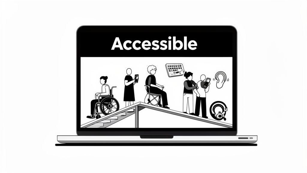
Think of your website like a physical shop for a moment. Web accessibility is the digital equivalent of adding a ramp to your front entrance. It’s not just for wheelchair users; that ramp also helps parents with pushchairs, delivery drivers with trolleys, and anyone who finds stairs a bit of a struggle. In the exact same way, an accessible website doesn’t just help people with disabilities—it creates a better, more straightforward experience for every single visitor.
Great website design is, by its very nature, inclusive. It means making sure everyone, no matter their physical or cognitive abilities, can easily use and interact with your site. This is much more than just ticking a compliance box; it's a powerful business strategy that grows your audience and builds a rock-solid brand reputation.
For a lot of small business owners, the word "accessibility" sounds complicated and expensive. The good news? It doesn’t have to be. Modern design tools and a focus on a few key principles can make a huge difference without needing a massive budget. It’s all about making smart, considerate choices right from the beginning.
Core Accessibility Concepts for SMEs
Getting started with accessibility is probably easier than you think. By concentrating on a few high-impact areas, you can dramatically improve your website for a much wider range of people.
Here are the key principles, broken down into simple, actionable steps:
Descriptive Alt-Text for Images: Whenever you add an image, include a short, descriptive "alt-text." This text is read aloud by screen readers for visually impaired users and also helps search engines figure out what your content is about. Instead of "image1.jpg," write something like "a smiling barista handing a customer a latte."
High-Contrast Colours: Make sure there's enough contrast between your text colour and the background. Faint grey text on a white background might look minimalist, but for people with visual impairments, it can be completely unreadable. Tools like the WebAIM Contrast Checker will tell you instantly if your colours pass the test.
Keyboard-Only Navigation: Can you get to every part of your website using only the 'Tab' key? This is absolutely vital for users with motor disabilities who can't use a mouse. Try it yourself—see if you can access every link, button, and form field in a logical order.
Real-World Impact: A SaaS startup was struggling with sign-ups for their free trial. Their website used low-contrast colours and confusing navigation. After a simple accessibility overhaul—darkening their text, adding alt-text to images, and simplifying their menu—they saw a 45% increase in free trial conversions in just three months. They didn't just meet standards; they connected with more customers.
Accessibility Is a Conversion Multiplier
Making your website accessible isn’t just about doing the right thing; it has a direct impact on your bottom line. An accessible site is an inherently more user-friendly site, which boosts engagement and conversions for everyone.
Research shows a clear financial upside. Accessibility-compliant websites can convert up to 29% better than their non-compliant counterparts. With digital accessibility acts becoming more common, businesses that get ahead can tap into a huge market. Consider that 15% of the world's population experiences some form of disability. If you ignore accessibility, you are actively turning customers away. You can find more insights into the state of web design on Clutch.co.
To get direct feedback on where you might be falling short, try embedding a simple form on your site. A tool like Weavely.ai lets you create an unobtrusive survey asking users if they ran into any difficulties. This gives you priceless, real-world data to guide your improvements and shows you genuinely care about every visitor's experience.
Turning Clicks into Customers
Let's be honest. A beautiful website that doesn’t bring in leads, sales, or enquiries is nothing more than a very expensive online brochure. The true test of a great website design is its power to turn a casual browser into a loyal customer. This is the heart of conversion-focused design—part art, part science, all about guiding people to take a specific, valuable action.
Every single thing on your page, from the headline right down to the colour of a button, is either helping or hurting that process. The goal is to make the action you want them to take the most obvious, easiest choice available. It's about paving a smooth, frictionless path from their very first click to the final "thank you" page.
This isn’t about guesswork. It’s about getting inside your customers' heads to understand what they need and how they behave online. Once you start thinking like them, you're on your way to building a site that doesn't just look good, but actively grows your business.
Crafting a Path to Purchase
To build a website that actually converts, you first need to map out your customer's ideal journey. What problem are they here to solve? What information will give them the confidence to click "buy"? Getting ahead of these questions is the key.
This journey needs a few non-negotiable design elements to support it:
Crystal-Clear Calls-to-Action (CTAs): Your buttons need to pack a punch with strong, action-oriented words. Forget a vague "Submit." Go for "Get Your Free Quote Now" or "Download My Guide." Make them pop with contrasting colours so they’re impossible to ignore.
Intuitive Navigation: A visitor should never have to think twice about where to find something. Keep your menu simple, logical, and use familiar terms. If a potential customer gets lost, they're gone for good.
Trust Signals: People buy from businesses they trust. Sprinkle your site with customer testimonials, glowing reviews, industry awards, and security badges (especially for payments). This reassures visitors they're in safe hands. In fact, a study by BrightLocal found 76% of consumers trust online reviews as much as a recommendation from a friend.
When these elements work together, they build a powerful argument for why a visitor should choose you, guiding them naturally towards making a purchase.
From Guesswork to Data-Driven Decisions
So, how do you really know if your design is working? You stop guessing and start asking. Getting direct feedback is the quickest way to find out what's confusing people or stopping them from converting.
You don't need fancy, complicated tools for this. A simple survey embedded on key pages can give you a goldmine of information. For example, you could use a tool like Weavely.ai to create a small pop-up on your checkout page that asks, "Was there anything that almost stopped you from completing your purchase today?" The answers are pure gold for fine-tuning your design.
Key Takeaway: A conversion-focused website is never really "finished." It’s an ongoing cycle of listening to your customers, watching how they behave, and making small, smart tweaks to improve their experience—and your results.
Beyond just the design, a great website must be part of a bigger picture. For local businesses, this means getting good at optimizing the entire customer journey. This wider view makes sure every touchpoint, from discovery to follow-up, is consistent and effective.
If you want to go deeper on this, our guide on mastering conversion-focused design to boost your ROI offers more advanced strategies. By directly linking your design choices to business results, you can turn your website from a cost into a powerful revenue-generating machine.
Your Action Plan for a Better Website
Right, we’ve covered the essential pillars of what makes a website truly great. Now it’s time to stop talking and start doing. This is where we turn all that theory into a practical framework that can help you transform your site from just another URL into a proper engine for business growth.
The first, and often the biggest, question that pops up for small businesses is whether to go the DIY route with a website builder or bring in the professionals. There’s no single right answer here—it really depends on your specific situation.
DIY vs Hiring an Agency: A Simple Guide
Making the right call starts with being honest about your resources, your skills, and what you’re trying to achieve. A DIY approach gets you up and running quickly with low initial costs, while an agency brings expertise to the table for a more hands-off, strategic approach.
Here’s a simple breakdown to help you figure out which path makes the most sense for you:
Factor | Choose a DIY Builder If... | Hire an Agency If... |
|---|---|---|
Budget | Your budget is under €2,000. | You have a budget of €5,000+ to invest in a strategic asset. |
Time | You have several hours a week you can dedicate to learning and building. | You need to be running your business, not figuring out web design from scratch. |
Goals | You need a simple, professional-looking site up and running fast. | You need a custom, high-performance site built for specific business goals like lead generation or e-commerce. |
Skills | You’re comfortable with technology and don't mind learning new software. | You want expert strategy, SEO, and ongoing support without the steep learning curve. |
Your Immediate Next Steps
Whichever route you take, your immediate priorities are the same. A fantastic website is always built on a foundation of user-focused principles. So, if you’re itching to get started, here are four key things you can work on today:
Prioritise Mobile Users: Before you touch anything else, pull out your phone and look at your website. If the experience is clunky, frustrating, or just plain broken, that’s your number one priority.
Become Obsessed with Speed: Use a free tool like PageSpeed Insights to see how quickly your site loads. You’d be surprised how much simple fixes, like compressing your images, can make a massive difference.
Design for Everyone: Start with the basics of accessibility. Check your colour contrast to make sure text is readable and add descriptive alt-text to your most important images. It’s a simple habit that makes your site better for every single visitor.
Focus on Conversions: Every page on your site should have a clear purpose. Look at your key pages and ask yourself: is it blindingly obvious what a visitor should do next? If not, make your calls-to-action clearer, bolder, and more prominent.
The most effective websites are never truly "finished." They are constantly evolving based on user feedback and business goals. Start small, measure your results, and commit to continuous improvement.
Frequently Asked Questions
Stepping into the world of website design can feel like a minefield, especially for business owners trying to get it right. Here are some quick, no-nonsense answers to the questions we hear most often, designed to help you make smarter decisions for your digital storefront.
How Much Should I Budget for a Great Website?
This is the big question, isn't it? The cost can swing wildly depending on what you need. A common concern for SME owners is the investment, but it's important to view it as a tool for growth, not just an expense.
Going the DIY route with a platform like Squarespace might only set you back a few hundred euros a year. If you hire a freelance designer for a custom build, you’re typically looking at a range between €2,000 and €7,000.
For a more involved project with a full-service agency, expect the conversation to start around €8,000. The trick is to stop thinking of it as an expense and start seeing it as an investment. A truly great website should always bring in more money than it costs to create.
How Long Until I See Results from a New Design?
You’ll likely see some immediate wins. Technical fixes, like a massive boost in site speed, can improve how users engage with your site right away. But the bigger, more impactful results take a bit of patience.
For things like climbing the SEO rankings and generating a steady stream of leads, you should plan for a three to six-month runway.
Search engines need time to crawl and make sense of your new pages, and building authority online doesn't happen overnight. The best way to speed this up? Have a solid content marketing plan ready to go the moment you launch.
Can I Improve My Website Without a Full Overhaul?
Absolutely. You don't always need to tear everything down and start from scratch. Often, the smartest move is to focus on high-impact, low-effort changes that give you the best bang for your buck.
Your Quick-Win Checklist:
Speed Things Up: Compress your images and turn on browser caching. It makes a huge difference.
Sharpen Your CTAs: Are your main buttons clear and bold? Make them impossible to ignore.
Check on Mobile: Seriously, grab your smartphone and go through your entire site. Is it easy to use?
Add Fresh Testimonials: Nothing builds trust faster than recent, glowing feedback from happy customers.
A quick website audit can help you pinpoint exactly where the problems are, letting you focus your time and money where they'll make a real difference.
